Some notes on the limitations of the medium.
Published
November 2025
Slug /canvas-ui
Type
essays
The easiest way to write this post is to re-trace the steps I took myself to get here. Where “here” is my fairly critical attitude towards apps that use the infinite canvas as their primary (or worse — only!) interface pattern. But before I dive into a few hundred words on what they get wrong and a few suggested fixes, here are some things that canvases are quite good at doing:
Being the simplest ZUI: They used to be all the rage, these zoomable user interfaces, back when larger screens were the more popular device size. They let you fit large things into the viewport (provided that the smallest meaningful unit does actually fit into the viewport), they let you see everything at once, from far away. Every modern map app is a ZUI, and the interface is a perfect fit for them.
Workflows with lightweight branches: You’ll hear people refer to this kind of usage as “non-linear”, and make claims about semantic spaces and linking. I’m not a huge fan of those ideas, and instead believe that the main value comes from providing intuitive branching, and the speed of iteration that comes from exploring options through quick duplicating and parallel editing. In some canvases, this lets you see the history of the work in a satisfying way. But if you get into serious branching usage it often devolves into visual chaos. More on that later.
Freeform element placement: One could argue that this is nothing special, since diagram tools have been around forever (the streets will never forget MS Paint, and consultants will never escape Powerpoint). But being able to place things where you want them is a hard problem in the world of multiple screen sizes, so the canvas is one of the few places that offers that capability anymore.
I first encountered serious usage in Excalidraw, followed by Muse, Figma, then tldraw. The popular usage pattern for all of them is “design tool”, and ranges between rough sketches to exact mockups. When I started work on my own app, the goal was quite different.
My initial desire was fairly straightforward: I wanted a digital workbench to keep track of multiple projects/artifacts that was better than a simple list (where most items would be pushed below the fold) and with a better interface than a spreadsheet. At the time, I used Scapple, which was near-perfect apart from the fact that it didn’t have a web app.
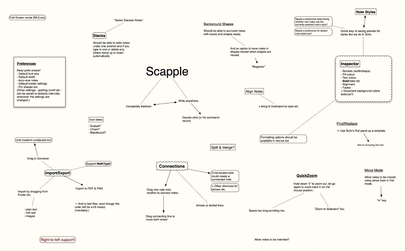
So I decided to re-make Scapple, but in the browser. Even going so far as to name my project Scrapple to make the lineage obvious. Doing so would require building an offline-first canvas with rich text elements, visual customization of said elements, arrows, and simple media handling.
As I prototyped and used the thing, I started to see that many of those features were not really in service of the initial goal of 2D organiser, and what I was making was closer to a publishing tool. Soon enough, I realised that I actually cared more about the publishing part (this is now part of my general attitude towards design: encouraging more public-facing things).
But the majority of infinite canvas apps are built with a single user in mind; usually yet another insular notes app. Good publishing tools ought to enforce norms that readers can learn easily, and provide constraints that the author must work within. The canvas…does not do that.
“fast creative iteration….the generated work is never the final product” is almost the opposite of a publishing tool.
All of which is to say, I realised that the canvas was the wrong medium for my goals, which is why I switched to making a multi-column rich text editor instead. It satisfies both my “have multiple lists on the screen” and “make a webpage builder” desires, while being much more amenable to power user patterns like keyboard-first usage. Thus, Scatterpad was born.
Also, had I stuck with the canvas, most of my effort would have ended up equal to “tldraw but with rich text”, a feature which they added less than two years later.
But the outcome of all this wandering in canvas land is that I have a bunch of thoughts about them, not as many as Mr. Nulls or Jess, but a fair number nonetheless.
Fair warning, almost any solution that is merely suggested instead of actually being implemented somewhere will likely suffer from “too clever by half syndrome”. Aspirational concepts which only show their flaws in implementation.
One of the few design questions I care about, especially w.r.t software, is “what behaviour does this thing encourage?”. With canvases, it seems to be: messiness and no cleaning up until its too late.
Because the canvas is such a singular medium, you’re encouraged to put every detail of your project into a single board. And the resulting mess forces you to hold the system in your head while you’re using it. Which isn’t something I like my interfaces to do.
One of the solutions I’d like to see tried is a windowing system to have multiple canvases open at the same time, being able to drag and drop to transfer things across them. Or secondary spaces like sidebars, panes, and shelves, so less is done on the canvas. If you must have everything in one place, at least provide focusing patterns, like hiding and showing non-essential elements as appropriate.
To be even more prescriptive, perhaps a max item count per page to encourage using each page as a single, specific artifact. Like a birthday card.
Side note: I’ve always found it funny how Figma’s engineering team works on incredible technical solutions to make really large pages work, and each improvement just encourages users to make pages even larger.
Being able to place things where you want them includes paying the price of having to do all the placing yourself. Including, but not limited to:
Some of these problems have half-decent solutions. Like auto-distribute to space things equidistantly, or showing alignment lines while dragging. But these are ways to make the positioning work easier, not actually getting rid of the work itself.
Muse, for one, has a neat solution for the text editing experience, they call them “text blocks” and they work by putting each paragraph into it’s own block within a vertical list. So you can drag items out and slot them into other places, while ensuring alignment isn’t a manual process.
Oh, tldraw’s shape-bound arrows are amazing too. We need more stuff like them. Amelia Wattenberger has a few ideas that might be worth trying.
On narrow screens, there are only two choices for UI: become a list, or become unusable. It’s a tragic constraint, but a strict one. Canvases definitely do not fit into lists. On the very devices built for pinching, swiping, and tapping, the canvas is decidedly a second-class citizen.
We can try to tame them, but any rule (e.g. list items in order from top-left to bottom-right) will be a weak one due to the variety of idiosyncratic usage patterns. It defeats the point of being a wide open space, really.
Again, they’re made to be non-linear, which means there’s no real start and end points standardised by the format. If you don’t do a ton of organisational work, it turns into a mess that makes sense to nobody but yourself from <10 minutes ago.
Even if you do organise, it’s fairly arbitrary. Because an infinite canvas has no borders, it’s not like your desk anymore. There is no “spatial memory” to be leaned on because there is no enforced permanence at all. Things can be in a completely different location the next time you look for them, nothing’s going to stop you from shifting things around.
Yes, you can carve out named zones, or hope your tool provides a grouping primitive (like line dividers, or stacks), that’s a good start. You could even be able to create deep links to said zones on your canvas to share specific things with people without asking them to navigate the chaos. But the chaos still exists.
Again, Muse has some good ideas here:
Panning is natural on a touchscreen, bearable with a trackpad, painful with a mouse. Zooming follows a similar order, but the scroll wheel is perhaps better than the trackpad. But in any case, the order of those lists shows how the most productivity-focused devices have worse affordances for canvas navigation.
Which is funny, because the fine-grained pointers of those devices are more suited to item manipulation than clumsy fingers (where dragging and scrolling are the same gesture) on touch devices.
Point being, there just isn’t an interaction paradigm that is optimised for both parts of the canvas’ demands. Compared to our regular grid and list-based interfaces, “it’s not as good for drunk users”.
Think about if something else would serve your needs better than a literal canvas. For me it was multi-columns, I’d encourage you to find something like that too.
If you still want to do a canvas, think again. Are you absolutely sure you can’t come up with a different thing? No? Alright then.
Use tldraw.
Despite their recent license change for tldraw v4.0 onwards, they’re as good as it gets. I plan to stick with using v3 myself when I eventually add a diagram tool to Scatterpad.
And if you really want to make one from scratch, here’s some stuff that I wished I’d read before I started doing things in a “I’ll figure it out” way. Oh, also, if your canvas doesn’t need rotation, that simplifies many of the interactions.
If you feel like commenting on this post, send me an e-mail at judah@joodaloop.com. I check all mail and respond within 2 days.