There’s this annoying tension between personal and public that comes with personal websites. Are they a home or a gallery? A personal record or a public document? Should the design be straightforward and accessible or a forceful assertion of personality? On the one hand, it feels like it would be fun to have a massive index of everything you’ve done, thought, or written about, all in one place. On the other, this makes it harder for people to find the bits that might be worth reading.
I am on the side of the reader.
In practice, this is expressed through a respect for their time, device, bandwidth and emotional experience while visiting this web property. The principles and various mechanisms that are in service of this respect are detailed below.
Principles
Content quality
New posts are only added if I think they clear the bar of being…
- Good information: My lists are careful curated indexes of external information. I only publish opinions that are rare enough that I haven’t seen them elsewhere.
- Novel topics: Pages like My Inventions and Things I Do To Procrastinate are ideas I haven’t seen before.
I’m also inclined to adopt new formats when needed (my Riffs and ~~~ pages are examples), so that I don’t have to abuse a single format for different purposes. One of the great tragedies of websites is how much the “essay” or “blog post” has become the default format.
I often spin off content that deserves custom presentation into microsites. My blogroll page turned into map.joodaloop.com, and I created a list of purchase recommendations as a custom buy.joodaloop.com page.
Lightness
I knew the web was getting bloated and slow, I just didn’t know it was getting this bloated. There are Javascript bundles the size of entire mobile apps being downloaded each time I visit sites that could have been plain HTML.
My site uses the minimal amount of semantic HTML for all it’s elements. It is perfectly readable without any CSS. It is functional without any Javascript. It acknowledges the pace layers of the web.
The tiny amount of (non-critical) Javascript on this site is used for…
- switching between dark/light modes, and swapping fonts
- a web component that adds search functionality
- a Service Worker for caching the content for the whole site
- a small analytics script
My site uses custom fonts (total size: 30Kb), but makes sure to carefully subset them to only the required UTF ranges, and cache them forever after first load.
Images are compressed to within an inch of legibility, and also cached forever. However, images don’t use the efficient WebP format. Since I only have a few of them, the few bytes of savings are worth trading for the universal compatibility of the JPEG format.
The result is a website that scores a 100/100 on Yellow Lab Tools, and is a comfortable member of the 250KB club.
Speed
This site is fast. It crushes every speed test I could find. It does so by virtue of being “just some text” hosted on a CDN. There’s no server, database or anything else that could ever be a source of slowness.
This site is faster than any other site you’ve used. Pages open instantly (the very next frame) after a link is clicked. It does not care about if your network is slow, or if you’re even connected to the internet. It is fast, even when you’re completely offline!
To achieve this, I cheat. This cheating is made possible by two things:
- A browser technology called Service Workers: When you open a page on this site for the first time, a Service Worker downloads the rest of the site’s pages in the background and stores it in your browser. Every page you open after that is served from this local cache. No network required.
- The aforementioned lightness: The site’s content that I cache takes up around 350Kb in bandwidth — my entire site is smaller than the average Wikipedia page! This extreme tiny-ness is why I can justify downloading the whole thing even though you may have only visited a single page.
The code that achieves this is just two files: a shell script to create an index, and the Service Worker itself. This requires a post-build step, and means that this site has a Makefile now.
Functional design
I love weird personal sites and near-unreadable layouts. I’ve even designed some myself. But for better or worse, this version of my site seems to have unconsciously adopted most parts of the brutalism code of practice.
- Don’t be influenced by tools
- Use a system font and only one
- Write clean code
- Write your own CSS
- Don’t use Javascript (if you can avoid it)
- Don’t hack the scrollbar
- Don’t create custom cursors
- Don’t use an effect just because you can (especially fade effects)
- Have as little design as possible
- Make navigation obvious or not at all
- Be practical rather than pretty
- Don’t use gradients or shadows
- Use high contrast colours
Carl Barenbrug, Brutalist Web Design
Over time, I’ve added improvements over the default layout and styling, culminating in the following design choices:
Title search
You can pull up a Spotlight-like search bar anywhere on my site by hitting
Styled RSS feed and sitemap.xml pages
With the cursed magic of XLST, the two XML pages on my site no longer look like a raw mess of indented tags, but isntead are styled to be human-readable pages.
Dark mode
I finally relented, and added a readable dark theme to the site. But I couldn’t resist being clever and adding a two-way toggle that still manages to respect your OS’s settings by default.
Simple navigation
If you open the pages in the main website nav bar, you have access to every page on the site, there’s no third level of navigation, pagination, or footer-only pages. The home page has a list of changes across the site so that new visitors can know what’s up.
Fallback image styling
My site’s content loads while offline, but images don’t unless you’ve viewed them before. So it’s possible to open a page and have the image fail to load:
The default browser fallback is an ugly one, so I replaced it with this more descriptive element.
Page metadata
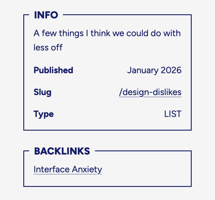
Every post page has a small metadata section displaying date of publishing and the type of post. But my favourite detail is how it displays the page’s slug. I take great care to create memorable, semantic URLs and I enjoy showing them off.
Backlinks
I finally have enough pages that point to each other that a backlinks section became a useful feature instead of a vanity design element.
Typography
I use Figtree for everything other than code, where I use Comic Mono instead. If you press the “J” in the top left corner of this site, it will switch the main font from Figtree to a handwriting-style one called Shantell Sans. This is both a gimmick and a legitimate delight because my site looks great in both styles. Shantell Sans has a “bounce” setting that I use to make the page titles look wavy.
View all typographic elements
My h2 headings are quite large
I’m a fan of large text elements, and mourn how they’re rarely used by all the tasteless people on the indieweb who rejoice in ugly websites and minimal styling.
I use the text-wrap: balance CSS property to style my large headings (h1 and h2), it’s almost always a good idea when using large text. I also use the property for my paragraphs, but with “pretty” instead of “balance”, of course.
My h3 headings are heavy
So that they can stand out enough to mark a section clearly.
The h4 ones are often paired with a single paragraph under them
Usually lists where the item needs a paragraph of descriptive text.
Speaking of lists, here’s my ordered and unordered list:
- I use regular decimal numbers, but notice that my number markers have bold styling applied
- Reason: I like the visual contrast, and my list items often start with a bolded word/phrase.
- Regular lists use the en dash ("–") as their marker.
- I find them to be the most visually balanced symbol compared to any custom icons.
I also have a bunch of inline elements, like <code>, strikethrough and key with noticeably distinct styling. My bold and italic is quite vanilla, although I am considering making italic do something novel. Maybe a large font size? A weird underline?
My links, however, are the most important of them all, given how much I use them. I therefore chose to style them with background color so they really stand out. And since the underline is the classic link indicator, it’s what shows up on hover.
Since the experience of clicking an internal link is an instant page load, I decided it should have a meaningfully different appearance. So I added a light underline.
My blockquotes are rather plain, the only special thing about them is that I include the
<cite>element to link to the original source.Me, on joodaloop.com
I barely use code blocks — because I don't think code is worth writing about aymore — but I do have custom styling for them anyway. But no syntax highlighting since I don't think short snippets of code have need for it.
I’ve not yet found a use for tables or todo lists.
I’ve also designed a couple custom elements that show up in prose.
- Chat quotes: A special kind of blockquote, designed to look like a text message conversation. The announcement post contains an example.
- Prose word grouping: To prevent a phrase or keyboard shortcut combination from wrapping across different lines, I added a
<no-wrap>custom element.
Stack
It’s 2023 2024 2025 2026, and web hosting has never been cheaper. Other than the $10/year that I pay for the domain, it costs me nothing to put this website online.
- Hugo is my website generator of choice, because of how fast it is.
- Tigris is where I host my images and other large media files that I don’t want bloating my Git history.
- Github hosts the code and content for this site.
- Netlify has been my deployment platform almost half a decade.
- Porkbun has been my domain provider ever since Google Domains died.
- Counterscale is what I use for minimal
self-hosted analytics.
If you feel like commenting on this post, send me an e-mail at judah@joodaloop.com. I check all mail and respond within 2 days.