A few things I think we could do with less off
Published
January 2026
Slug /design-dislikes
Type
list
Obviously, many of these opinions are more personal than objective. But that’s true for all the software we use everyday. Most design decisions can be traced back to one man’s (yeah, usually a man) strong preference. We live with their consequences decades later.
So I hope you read these as just another calibrative data point, not as dictums. Also, I hope you give me credit for turning this into one long list instead of milking it for multiple short riffs.
Recently, my personal design work has coalesced around the prevention of interface anxiety. An extra click, a different screen, and the expectance of latency between them are all experiences that add up to a fragile-feeling environment.
But there’s a more subtle version, that of abstraction and spooky action at a distance. Tying things together (i.e. complexity) in vague and shadowy ways is the surest way to build a confusing system.
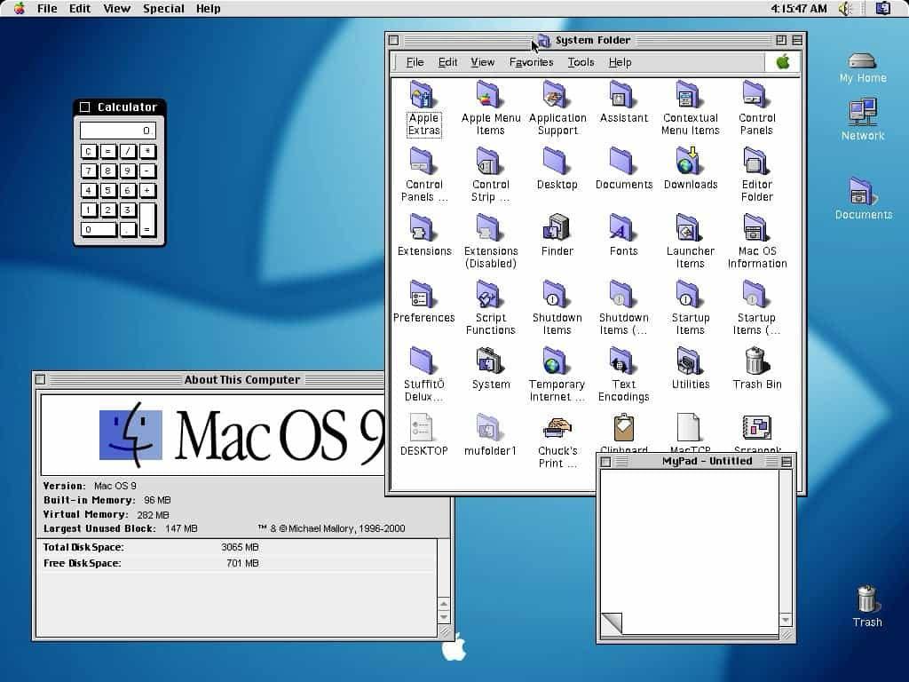
Back in 1984, explanations of the original Mac interface to users who had never seen a GUI before inevitable included an explanation of icons that went something like this: “This icon represents your file on disk.” But to the surprise of many, users very quickly discarded any semblance of indirection. This icon is my file. My file is this icon. One is not a “representation of” or an “interface to” the other. Such relationships were foreign to most people, and constituted unnecessary mental baggage when there was a much more simple and direct connection to what they knew of reality.
[many sentences later] Even the smallest disconnection shatters the illusion, turning what was once an utterly convincing and understandable world of files and folders into an arbitrary heap of windows, full of icons and widgets, signifying nothing.
John Siracusa, “About the Finder…"
I love them enough to use them all over my site, but i do not love:
For similar reasons, I (and Jake Archibald) dislike footnotes on the web. But I do think that popup and margin notes are a fine substitute – anything that doesn’t jump you away from the text you were reading.
There are valid uses for “pulling content from a source file into a destination file without copying it, so changes to the source automatically update all instances”, like documentation or embedding a view of a live feed. But for everything else, I’m not a fan.
My main objection is philosophical: Facts are temporal.
A document is a thing that reflects information as it existed at the time. Inserting it elsewhere now ties together two things that probably have different update schedules. You now have something that’s alive in two different places. Each interaction requires you to keep track of those two contexts. How does changing this thing in front of me affect every other place that it’s present?
My preferred solution is just copying and pasting the necessary content to its new location. Redundant, but robust. This is similar to the folk practice of posting screenshots of tweets instead of quoting them, making them immune to editing, deletion, or privacy settings. This is also what Gwern does for his popups, creating a manual copy of Wikipedia pages or other documents.
Even the usage patterns for transclusions are often rather finicky:
In Obsidian, when users create a block link, a hexadecimal identifier is inserted into the referenced block. This identifier creates a more stable link than our snippet references. But many of our test users mentioned that they don’t use Obsidian’s block references because they find these identifiers messy, and because they worry about accidentally “losing” the identifier when editing the file.
(I recommend reading the whole thing, it’s one of the few examples of a design case study that’s actually good.)
The unfortunate consequence of holding notions of “purity” or “simplicity” above goals that are real and present. Clinging to the initial version of a vision, refusing to accept the lessons of Worse is Better. Letting your decisions be guided by raw ideas instead of the gentle pushback of reality.
I don’t have much of a problem with “liquid” materials on smartphones, provided they animate quickly and smoothly. I do have a problem with heavily padded floating buttons, sidebars and other UI elements stealing valuable screen real estate on my Serious Computer, the Macbook.
And I’m not a fan of background content showing through overlays either, I really wish the “glass” part of the aesthetic was something more robust (like metal perhaps, ferrofluid is cool).
I wish more apps took a strong stance against it. There is nothing forcing developers to deviate what they think best suits their brand and functionality. Third-party software for serious work (Blender, Musescore) will have nothing to do with the trend, and I’m hoping Apple’s own power tools (Logic Pro, Final Cut) continue to stick with what’s best.
P.S: I would put $50 on Apple walking back most of this design direction by 2028. Unless they ship a touchscreen Macbook, which would be the beginning of the end for fine-grained pointing devices.
I am an unapologetic Tufte graphics and Magic Ink shill. If software must manifest as pixels, let us make them useful pixels. I dislike attempts to go against this principle for no good reason:
Even choice of words can make a difference here, a subtitle here or long heading there might make for a more “balanced” layout, but it’s often better to just ditch those words completely.
Gwern’s critique exists and is thorough. My own comment is simply that Nelson & Co. were just not very good designers. They were ideologically married to particular features and means of achieving a goal. They talked a big game about “new forms” of media but Xanadu was just a literature nerd’s stubborn ideal for interconnected computers.
Yes, the future will have many more barefoot developers with home-cooked apps than we’ve had before. Yes, more internal tools will replace some SaaS products. And yes, there will be more truly personal software.
All of this is not something I’m very excited about. I’d even say I detest this attitude of software as an insular pleasure. The Memex is one of these ideas that has refused to go away, especially now, with the idea of combining AI with a personal knowledge store.
McConaughey gets at something that seems obvious to me but few say. I don’t want a mind aligned to some gestalt of the collective psyche to steer me towards median ideas. I just want to talk to a smarter and better informed version of me who can tell me what i, specifically, would think if i were cleverer and better read.
I can think of few things less interesting or antisocial. To quote @zetalyrae’s post I Wish People Were More Public, which in turn quotes Dante:
You may say reading in public is performative. I say reading in private is solipsistic. Dante, in De Monarchia, writes:
All men on whom the Higher Nature has stamped the love of truth should especially concern themselves in laboring for posterity, in order that future generations may be enriched by their efforts, as they themselves were made rich by the efforts of generations past. For that man who is imbued with public teachings, but cares not to contribute something to the public good, is far in arrears of his duty, let him be assured; he is, indeed, not “a tree planted by the rivers of water that bringeth forth his fruit in his season,” [Psalms 1:3] but rather a destructive whirlpool, always engulfing, and never giving back what it has devoured.
Make things for groups! For the web! For strangers and enemies! And make these things as open and cross-compatible and publicly as possible.
See also: Self Hosting is selfish
Software that uses words like “automagically” or “in the background” rarely makes for a reliable tool. It is a mistake to start from “users shouldn’t have to do X”, instead of “let’s observe usage and see where the real bottlenecks are”. Tasks can be made easier, batched, before resorting to removing them completely.
One of the best ways to raise the background anxiety level of a system is to have it do things the user can’t see, and present the (oft-broken) final results with no explanation.
Things where the decision is made simply by asking “what does everyone else do?” with no concern for differentiating factors. The opposite of design, really. The person on the other end of your software suffers to save you a little extra thinking.
This is part of a general complaint against the landing page cargo cult of “single sentence value proposition”. People can read more than 6 words, they can even read multiple paragraphs if you write them well enough. If you actually know what you’re trying to do, just say that, in as many words as are necessary.
When it comes to CTAs though, there is lots of sense in making sure the main action is easy to take. Put your signup button in the navigation bar, and make it easy to see. But stop expecting people’s first action on opening your site to be “get started”. If that was true, you didn’t need a website in the first place.
I have a longer critique of this pattern, but it can be summarized as…
Freeform placement is very useful (nodes & wires, Indesign, moodboards, Powerpoint) but it doesn’t have to be infinite to do so. The freedom to do anything comes at the cost of having to do everything (arranging, cleaning up, sorting) and the infinite expanse makes for an uncertain navigational experience (everyone has their own way of arranging things).
Don’t steal focus unless completely necessary. I have never felt myself thinking “yes, please block my view of the screen, preventing me from clicking anything else behind your stupid popup confirmation box”.
Don’t ask me to move my mouse away from where it currently is, just to have to move back once I close the popup. Toasts are similarly annoying, and often implemented to be even more so (they disappear after a while so it’s possible for users to miss important messages completely if they happen to look away). But at least the industry has started to realize that.
I call it “the layout for when you have nothing important to say”.
The lovely thing about linear text is that you’re force to prioritize things for the reader; it’s a marvelous focusing exercise. The neat thing about two columns is how you can play related things off of each other; a dichotomy can have more narrative than just a list, and allows for the evergreen framings of “vs.” and “yes, and…”.
But a box of randomly positioned squares? It has neither narrative nor a history of usage. It is new and bad – the worst kind of bad. It’s not entirely coincidental that Apple was the one to bring them into popular usage, right around the time their marketing became “hey! here’s one big list of small features”. Lazy designers love anti-design, anti-design loves bento boxes.
I understand the temptation to add them, trust me I do. They do a few really useful things:
But you can provide other stable reference points, like a floating menu button. Or a breadcrumb trail, which is more useful and explicit.
As for navigation, what percentage of a user’s time is spent in the act of navigating from one page to another? What percentage of that percentage is spent navigating to a place they already know the name of, and could jump to directly using a search?
To quote my friend Manav, “No one uses their computer like this anymore because minimum window sizes are too large”:
Notice how none of those apps have sidebars, leaving more space for content, and as a result they remain usable at small window sizes.
i wish to expand on the “data-ink ratio” idea with the “live pixels ratio”
measured by how much an interactive item on a screen achieves (frequency x power) relative to how much vital space it takes up
If you think about it, you’ll realize sidebars have a pretty terrible live pixels ratio.
Please pick/tune good fuzzy find algorithms. If I’m looking for “head”, there’s no reason that I should see “padding” in the list of results. It just doesn’t feel right, even if your code says they’re basically the same thing.
Semantic search based on embeddings, done well, can make for powerful retrieval/classification engines. But when dealing with person-sized data, regular search is usually all you need:
And more importantly, the hybrid results sometimes failed the “why on earth did this result show up?” test. For example:
Looking for a recipe I typed “bread” and I got an AI paper with nothing highlighted… oh wait, I see… there’s a paragraph in this AI paper that mentions croissants. Are croissants semantically related to bread?
Opaque semantic matches can sabotage user trust in search results. In a keyword search, if I search a keyword, I either get results that contain those words or I don’t. It’s clear. With semantic search, you sometimes get results that are “kind of” related to your query, but without any obvious indication why. That can be frustrating.
Pao Ramen, Local-first Search
I have seen very, very few of them that didn’t make for a painful experience, one of them is Szymon Kaliski’s notes. Notice that it contains a complete index of every note, ordered by time, and with descriptive titles. He has also taken some care to only publish notes that are worth reading.
The “digital garden” as a design pattern usually does the opposite. They exist to provide authors with a dumping ground for unorganized information. Which is all well and good if you’re said lazy author, but the lack of grounding, order, ranking or quality control makes for a fatiguing reading experience. Studies have consistently found that people are much better at memorizing information when it’s presented in narrative form. “Atomic notes” encourage putting tiny bits of content at each URL, forcing clunky jumps through half-completed personal notes.
Now, the lovely thing about the web is that you’re free to do as you like, my demands are mere suggestions in practice. But if the browser is a printing press, I think it deserves a healthy publishing mindset.
If you feel like commenting on this post, send me an e-mail at judah@joodaloop.com. I check all mail and respond within 2 days.