why do you want a progress bar
that implies deadline
because my day ends!
one reason i ruin sleep is i refuse to let the day end
This page is an experiment in more frequent publishing. I need this format of a classic weblog because I occasionally feel the need to write just title and a few paragraphs and not have to face the quality/length bar I set for capital-E Essays.
This section also let’s me use my site’s RSS feed as a way to communicate with it’s subscribers more directly. For example, I use it publish some of the more significant Changelog items as individual updates, alongside similarly temporal announcements like project launches and progress.
Around a year ago, I wrote about how the current design of my site had proved undislodgable. You can see today that it has survived yet another year. Congratulations, site!
This stability has allowed me to focus on small refinements and new features. And enough of these changes have happened in the last few months to merit a version bump. Introducing, joodaloop.com v4.6, now with…
⌘ + K on any page. It’s a particularly nice experience due to the fact that pages load instantly.<details> element in order to compress that list to a practical length. And found further use on…#040c5b -> #141c6b), in response to critique by a particularly impassioned user.For the longest time, I lived in a terrific awe at the magic of the build step. Parsing, compiling, transpiling, and everything else that goes into the process of bundling web stuff was an arcane ritual that I crossed my fingers, closed my eyes, and hoped to never see a failure from. As a result, I have never written a build script, nor configured Webpack.
When I finally opened my eyes to the truth of how these things work (spoiler: it’s just moving strings around from one set of files to another), the fear abated. But I still held on to a sense of “purity” — I would get by with as little fiddling as possible.
But this week, I wanted my site to use a Service Worker to provide an instant navigation experience across pages, even in the absence of a network connection. As per first instinct, I went looking for the Hugo-blessed way to do this and…didn’t find one. It turns out, I’d need a post-build script. The horror! (if I was still a coward)
But I’m not anymore, and I have the LLMs to write the script and Makefile so I don’t need to learn the syntax. Nor do I have to live with a sense of “dear Netlify, please build my site from my Git push, thank you so much”, because I can build the site myself and upload it directly with the Netlify CLI. As a bonus, it’s around 50% faster than the old Git commit → Github → Netlify → CDN workflow I had earlier.
I’ve added a new top-level page to this site. It’s called ~~~ and can be found at joodaloop.com/~ or in the nav bar. The name is a big quirky, I admit, but format is simple:
One Big Markdown File where new entries are appended to the top.
The hope is that I practice writing things down more often, in a place where it doesn’t feel like I’m “notifying” people, or writing to an audience at all. There is no effortless way to link to entries, there is no RSS feed, and there is no organisation other than the chronological. It as an attempt to move things that look like personal notes into a public-facing page. Inspired, in no small part, by Nadia’s (recently taken down!) Notes pages.
While designing this new publishing location, I was forced into thinking about all the existing formats on my website; now grown from 2 items to 3…
One might well ask “why aren’t you using Streams for this?”, seeing as I made and maintain a service for microblogging. As all good questions, it leads to a fruitful line of enquiry — culminating in the taxonomy below, which I think covers all the things one can achieve with a microblog.
I will continue to use Streams for #1 (which makes sense, given that’s what it was built for), but I don’t think the other uses are suited to it. For example, I prefer to write Riffs in a proper text editor and over a period of many minutes. Not as a hurried message into a Telegram channel. Conversation, jokes, updates and recommendations are similarly all best done in places that have the capability for interaction.
The medium and the message and me have yet to exhaust all possible combinations of formats and workflows — with ~~~ as the latest addition to the set. My guess is that it’s primary roles will be journal, commentary, and thought-posting, which are currently underserved by existing outlets (believe it or not, I try to restrict my commentary on Twitter out of respect to my followers).
And I think it’s particular combination of features (self-ownership, low effort bar, personal/limited audience) is sufficiently novel that you should try adding one to your site!
In the before times (pre-enslopification of Twitter, and pre-LLMs (some would say they’re the same thing)), I had an exchange with Imp that produced the list you see below.
I no longer remember which of us began the discussion, but the question at hand was about technology that is often looked upon as a mistake in hindsight, or has dystopic vibes.
There are two reasons for me resurfacing this old list. The first is that I happened to be cleaning up my drafts and scattered notes (as part of a focusing exercise re. my career, but that’s another story). The second is because I find Robin Sloan’s “this is the best it will ever be” sentiment to be brutally real-headed.
It’s interesting and useful to imagine — really visualize — the chatbots and agents in ten years or twenty … barnacled with gunk … locked in a permanent cat-and-mouse game with their adversaries … just as a platform like Google is today. In 2036, you send your AI agent out into the internet, and it returns battered, bedraggled, inexplicably enthusiastic about a bargain flight to Bermuda.
Felt like a congruent enough set of things to make a small post about. It’s easy to miss the bad for the good when it comes to technological “progress”, and sometimes we’re not lucky enough to be able to walk back things that could be reassessed (see: smartphones).
So, cheers to all the times we’ve been wise enough to take the one step back. And pour one out for the things we lose when we’ve decided not to. I fear this is one of those times.
P.S: Since it is now 2026, I can of course ask the bots to expand on Imp’s excellent list. Here’s Claude’s attempt at doing so.
If I had stats and figures to back this up, I’d turn it into a proper post. As it stands, I only have anecdotes and gossip to speak from:
You would assume that people do live collaborative work on the same document. In practice, they get on a video call and one of them edits, the rest watch.
My memory of something Sunil Pai once said
I really like stateless systems with few moving parts. Static sites are so simple, I can host hundreds of them for free. I adore edge functions of all kinds (especially Cloudflare Workers) – being able to spin up microseconds of cloud compute on demand is lovely. Object storage like S3 is so cheap, people choose to build entire databases atop it. We now have serverless streams that I expect to be similarly amazing.
Realtime sync is often more complicated. I won’t deny that it’s cool to make a change in one tab, and watch the app update in a different tab/window/device, but recently I’ve been asking “is that really necessary?”. Do you really need to provision stateful servers and always on sync systems just to make people’s cursors move around a screen in realtime?
Figma is the poster child of realtime syncing, they spent ~3 years designing the whole thing. You’ll hear some people say that this let them beat Adobe and Sketch in the design tool arena. I don’t buy this narrative. The decisive feature was “share your design files with a URL”, not the ability for two people to move rectangles around together.
To me, the need for realtime editing in applications is greatly exaggerated. Think about how rare it is to:
And that’s if your synced app is multiplayer at all. For many apps, the only person I’m collaborating with is myself. I’m certainly not holding my phone and laptop open at the same time, frantically typing into each, expecting edits to sync across as I do so. If we have a future where more people make apps for themselves, it would be nice if they used cheap, simple systems to move data around. Sync is good, it doesn’t always have to be live.
But with agents, things might change. They are unrelenting daemons, ready to join in at a moment’s notice, and stay working for as long as you pay them to. I can imagine applications where having them keeping up with realtime changes is a big deal. Especially if there’s multiple agents all working really fast. They might just be the killer app for sync engines.
From an information design standpoint, the analog 3-handed clock is pretty terrible, needing a glance at three disparate points and multiple spatial calculations to arrive at a few numbers. But we forgive this inefficiency because they look rather nice.
What is less forgivable however, is the concept of displaying time as an isolated, static pair of numbers. As a general rule, I avoid numbers when visualizing quantities. I prefer a graphic that can convey the scale of the quantity instead (like the impact bars I added to items of the Frontier 2025 site). Symbols are indirection, and it’s hard to feel quantities by looking at their numerical representation.
I prefer my numbers to be placed within a narrative; the steady climb of a progress graph, a series of comparable lines, as squares of varying brightness. Especially when dealing with time, a quantity so linked to change that some people like to define it as a measure of such. It feels silly that I have to compare 4:00 PM and 8:00 PM through mental arithmetic instead of being able to simply see the difference.
And the subtractions are numerous and happening all the time. How much time until bed? When is the next meal? How much time has passed since I last picked up my phone? Somehow doing the subtraction in my head and arriving at an abstract number (2 hours on Twitter…) doesn’t feel as visceral as a physical representation.
I’ll admit I also hope that a 24-hour bar will add firmer bounds to a “day”…
why do you want a progress bar
that implies deadline
because my day ends!
one reason i ruin sleep is i refuse to let the day end
We have a few famous bars and grids for tracking progress through the year, a Japanese timer progress bar, and a ridiculous abuse of the clock metaphor for existential risk. But nobody wants to give me a 24 hour progress bar that I can pay money for and have delivered to my house. The best I could find were:
P.S: I do have a particular design in mind (see my Workbench page), but the more variety the better.
P.P.S: It’s slightly sad how most of the popular time-related progress bars are about scarcity (years left in an 80-year lifespan, days left in a year), because those clocks run out once and then it’s all over. A daily clock is much less cruel because it will refresh again the next morning! You get to see the hours fill up today, but with the knowledge that there will be new ones soon.
If you haven’t heard of calibration cases, you should read Commoncog’s introduction to them. A brief definition:
Calibration cases are business narratives that teach you to see. A calibration case is simple: it is merely a narrative of a specific business situation. What makes calibration cases special is how they are meant to be consumed: they are organised in sequence according to concept, so you are able to do rapid case comparisons across the same concept. This exercise helps you calibrate your expectations of the business concept in question.
If you haven’t heard me rant about how much of interface design is done by people saying insightful/stupid-sounding shibboleths, you can follow my Twitter.
Maybe they have their reasons to be so non-specific, but it means that most advice is scarcely better than personal opinion. “Form follows function. Make apps fun again! Make apps look old again!” I can’t recommend that to learn from.
Instead, I used to say something like “just look at lots of good designs and use many apps” to people who asked me for a how-to guide or direction of study. Because reading Refactoring UI can only give you a few simple rules, that can nearly always be safely applied. How do you become good enough to learn/break those rules?
I now think the I wasn’t far off with my original answer, you have to gather a corpus of cases in your head. Luckily there is more than one way to do this for design:
I believe that the “organised in sequence according to concept” part of the process can be done without, because design doesn’t really have that many distinct concepts. [Typography], spacing, hierarchy, and content is the majority of what I do.
This is not an uncommon sentiment – you may have seen this graphic floating around the internet as a dunk on the Apple design team. Their own Human Interface Principles used to warn against overuse of icons next to menu items.
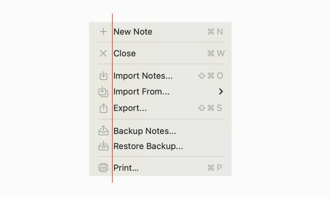
But if they are going to do it, I have a humble suggestion: lighten the icons so that the text is emphasized instead.
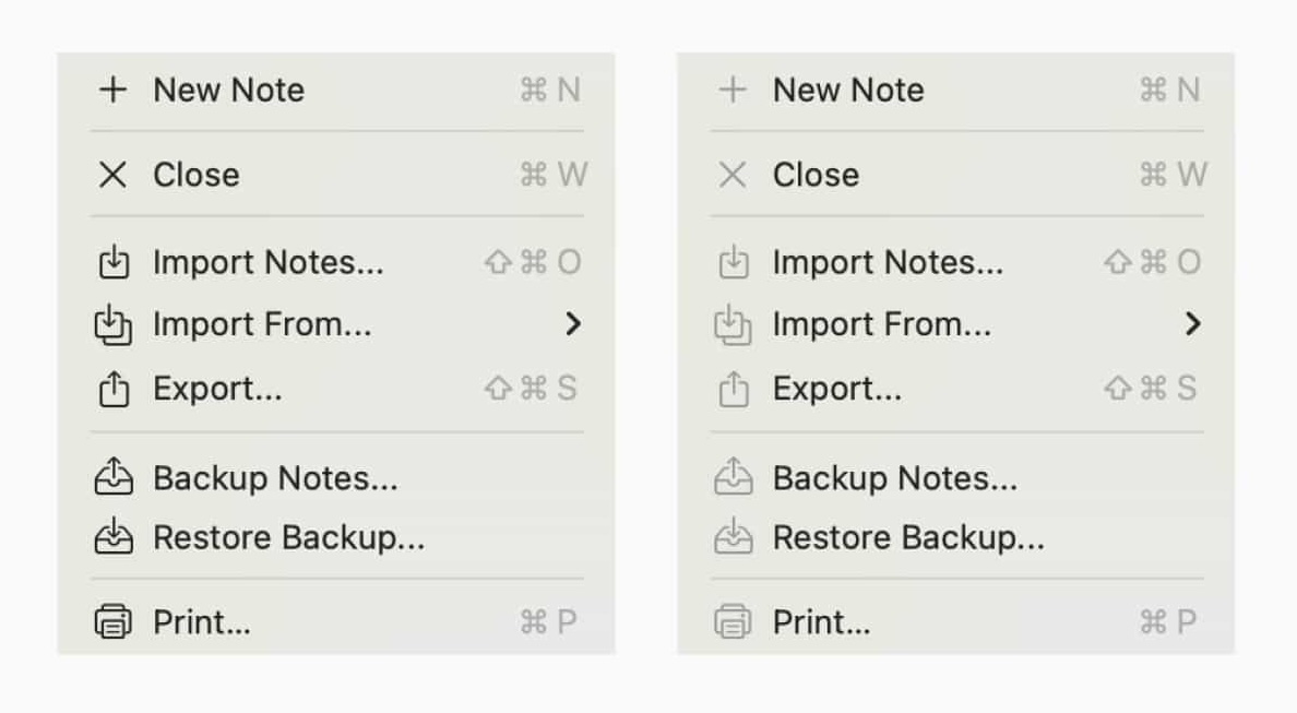
When lightened, the visual stating point shifts to the text itself, with the icon being demoted to an ornament instead of content. Which is what they always were – providing very little information compared to just reading the text. Especially when there are multiple densely packed icons that all look the same!.
Which leads me into some grumpy commentary re. Apple’s design failings of late. They have gone too far down the path of “ornament”, which is terrible way to approach something as fundamental as a desktop OS.
Dye had no background in user interface design — he came from a brand and print advertising background. Before joining Apple, he was design director for the fashion brand Kate Spade, and before that worked on branding for the ad agency Ogilvy.
Print is not a terrible attitude to bring to software (especially websites!), but it needs to be a tool applied in the latter stages of the process, not the starting point for “this is our new look”. Screens have flux, they’re more than paper.
The guidelines could have been “only add icons that have an unambiguous meaning, to items that would benefit from standing out in a list of actions”. Not that you need icons to do this, bold text would work just as well, but we’re being generous here.
But that’s not what they did. The idea is clearly just “ADD PRETTY PICTURES NEXT TO WORDS, THANK YOU!”. A case of graphic designer envy if I’ve ever seen one.
I spent a couple hours yesterday cleaning up my Github repos for all the versions of this site I’ve created over time. You can go to v1.joodaloop.com to see the first version, and change the version number to go all the way up to v6. My personal favorite was v2, which honestly deserves to be resurrected in some way.
Wait a minute… did I say v6?
Yes, there were two versions after the site you’re looking at now, that I built but never started using because I realised I liked what I already had. Which is why all I did was launch version 4.5 of the current design. But you can see those failed redesigns at v5 and v6 if you like. They’re not terrible.
I make at least 2 sites a month, most of them are static and written in plain HTML and CSS as much as possible. In fact, a few of my minisites (like map.joodaloop.com) are just a single HTML file written by hand. I really like keeping things as simple as they can be.
But I always run into the following annoyances as soon as more than one page is involved:
<meta> tags (page title, social media cards) for each page to the correct values.<p> tags I would start to miss the ability to write in Markdown.I’ve been told this is the moment when people turn to the dark side, and write their own static site generator — one that finally has the perfect, simple feature set and intuitive syntax. Luckily for all of us, I decided to double down on the site generator I already use: Hugo
So I put together Hugoloop, a starter that uses the simplest possible site structure for a Hugo site, and contains all the things mentioned in the list above. And everything that one might need is linked to in the README. To quote it’s introduction:
…the amount of Hugo-specific detail you need to understand is kept to a minimum. Your experience should feel as close to “edit some HTML, write some Markdown” as possible.
I’m trying out a new format on this site: conversations. You can expect to see it in different places/pages over time.
The design will probably change slightly in the future; but the more interesting questions are around what parts of the conversation I choose to display. Do I include random messages above/below the relevant slice? Do I preserve typos and “hmmm"s and “huh"s? How should privacy-preservation work?
Here’s an apt example (w/ Anjali):
i think conversations are the laziest tool for thought, because you’re just offloading cognition to the other person
well….
high variance
say more
they can force you into new avenues
think of them as an oblique strategy
they can also give you missing context, but that’s fulfilling a search function
but then again what is thinking if not search
think of them as an oblique strategy
such a good comparison, damn
but then again what is thinking if not search
search + reasoning
I don’t have much to say here yet, the point of this post is to link you to Innovation depends on Gift Culture.
Gift exchange flip the Lemon Market problem upside down, because of the particular social rules around gift-giving and celebrating intent. Gift culture has sacred protocol: if you’re offered a gift, you must accept the gift, and you must reciprocate either in return or by paying it forward. If I offer you a gift, saying, “Here is all this information, promise and potential”, then by the rules of gift exchange, you are obligated to take it seriously, and you are obligated to offer some potential in return, for a window of time.
And this tweet:
I’ve talked to a lot of ambitious elders about this and the general shape of the answer i found was that those who were most fulfilled were those who gave back to others. they’re proud of the difference they made to people, not the artifacts they produced or awards they won
@visakanv
I might eventually collect enough material to turn this into it’s own page someday, but for now it exists because it’s a good summary of how I try to live.
It will only go live in June, July, August September (!!!), but I just finished a partial redesign for this site, and I’m rather proud of it. I’ve arrived at a place where every kind of post format or type has a place here – from this tiny post you’re currently reading, to frequently updated lists like Twitter Bookmarks.
The Writing page was the only one that really changed to accomplish this. It turned into a dense 2-column page with sorting by topic instead of post type. The other pages only received small layout touch ups and tiny typography fixes. Oh, and the dark mode blue got darker. But that was all.
Edit: I also added a new “chats” format right before I shipped this version.
Which is good! This website has been through 4 designs in total, and this latest version has lasted as long as all the others combined. Not that I haven’t tried to replace it. v5 and v6 redesigns happened in the background, but turned out to not be worth shipping. The current version is, in fact, close to perfect. Who would have thought?
Shipped a starter template for Telegram bots on Cloudflare Workers, using much of the code from Ellipsis, but making the D1 database optional. It creates a bot that acts as an interface to Claude, using the Anthropic API.
The goal was to keep initial setup as straightforward as possible (you should be able to run this without creating a local copy of the code), and I plan to make all future features work the same way. There’s tension between minimalism and demoing a full-featured app though.
I just put together Telegram bot called Ellipsis, acts as a chat interface to Claude. Currently only accessible to me, and a couple friends.
Built with Hono and Drizzle, hosted on Cloudflare Workers with their D1 database acting as the storage layer. To start with it just has a simple 6 message context window, but I have a few more ideas that I want to try later.
I am now the proud owner of what is the most beautiful guitar I’ve ever seen or played.
For the very fair price of $750 American, it comes with excellent P90s, stainless steel frets, a carbon fiber reinforced and satin-finish neck, and lovely build quality everywhere else.
If that wasn’t enough, Yamaha also ships it with Elixir Nanoweb strings and a well-padded soft case. Good stuff!
Brandur's Fragments
Simon Willison’s Weblog
Micro by Tom Macwright
Simon Collison's Journal
Nico's Notes & Correspondence